- The Inbox
- Posts
- The Anatomy of a High-Converting Email (And How to Design One Fast)
The Anatomy of a High-Converting Email (And How to Design One Fast)
Max Sturtevant
October 29, 2025

The Inbox Newsletter

Hey it’s Max from The Inbox Newsletter.
Most brands obsess over how their emails look… and then wonder why nobody clicks them.
After generating $150M in email revenue, I can tell you: performance beats pretty 100% of the time.
Here’s how to design an email that actually sells.
Key Takeaways:
Good email design at it’s core is about guiding the customer to click.
The three parts of a high-converting email are: copywriting, structure, and graphics.
Most brands overcomplicate design and lose revenue as a result.
You can literally recreate winning emails using ChatGPT and Figma.
Image-only emails do work
Copy Comes First
Before you start designing anything, you need solid copy.
But not just any copy of course…
You need skimmable, benefit-driven, and action-oriented copy.
The 2025 inbox is ruthless. Customers don’t read, they skim. Your email needs to feel fluid so it’s easy to scroll.
Here’s what great copy looks like:
Headline that calls out the pain or benefit
Subhead with 1 sentence of punchy info
Short sections of body copy (1 sentence max)
Repeated CTAs throughout
Social proof or product highlights
Tip: Use ChatGPT to reverse engineer great emails. Copy + paste a brand’s email → ask GPT to generate a reusable template → input your brand → profit.
Structure Is Very Important
Even if your copy slaps, bad structure kills performance.
You need to guide the reader’s eye down the page.
Here’s the structure we use for 7–9 figure brands:
Hero section: logo, headline, subheadline, and CTA button above the fold
Bridge section: justify the hook with some quick info (think icons, not paragraphs)
Infographic/product highlight: keep it visual, not text-heavy
Final CTA: always give them a clickable next step
Footer: secondary links and brand elements
Repeat your CTA buttons after every section. If a customer scrolls and is ready to buy, don’t make them hunt for the button.
This example has everything we need with great copy and structure:
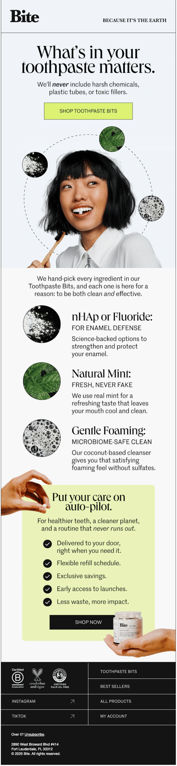
All Sections Needed Here
Design Should Elevate, Not Distract
Your design should support the copy and guide the scroll… not overwhelm the reader.
I HATE all the crazy flashy emails… these are blinding and distracting.
Keep it simple and use strong CRO tactics like button placement and button size.
Here’s what works:
Big, tappable buttons
Consistent color use and contrast
Clean sections that flow into each other
Smart use of infographics and visual proof
Subtle details: gradients, shadows, spacing
Make SURE to include infographics… avoid blocks of copy. Turn blocks of copy into graphcis whenever and wherever you can.
Want to See This in Action?
Words are great. But if you want to watch me design a 9-figure email live, you’ve got to check out the full video.
I walk you through:
The full design process inside Figma
How to write emails that convert without guessing
The exact structure and layout top brands use
And how to upload & send image-based emails in your sending platform
Email Inspiration Of The Day
Brand:
Osea
Email Design:
https://drive.google.com/file/d/1nwBIIj_ZQjYSlgf2L-GGv64GZ66tbqin/view?usp=sharing
Notes:
Love this email for any brand that has multiple SKUs. Gift guide based on price. You can do all sort of gift guide emails but I’ve seen the ones based on price perform the best.
Template of The Day
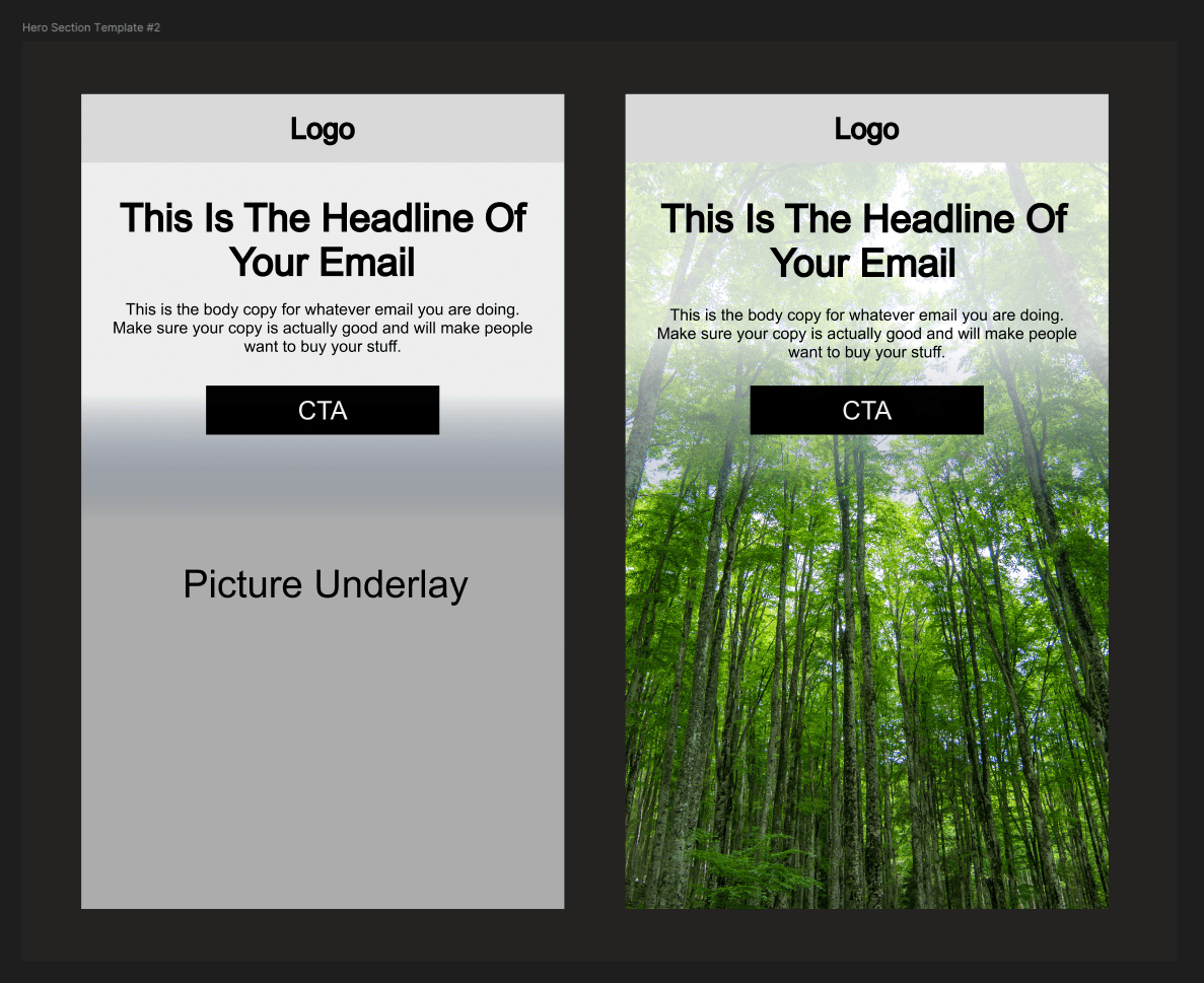
Hero Section Template #2
If you want access to a bank of 134 mix and match templates like this equating to over 5,000+ possible email designs, click here »
Reply to this email if you have any questions or further content you want covered.
Cheers,
PS - If you run a 7-9 figure ecommerce brand and you want to have a free email strategy consultation, book a call here »
PPS - I have a few different products you can buy. If you purchase any one of these products you get access to my private community of 1500+ members with daily posts from me, access to me for support 24/7, and private calls.
Ecommerce Email Mastery: A 60 lesson course breaking down everything you need to know about ecommerce email marketing in the most concise and organized manner. learn more »
Mix and Match Email Design Templates: 134 email section templates that can make 5,000+ unique email designs with, learn more »
QuickFlow Templates: All core 7 core email marketing flows fully templatized with examples, learn more »