- The Inbox
- Posts
- The 75/20/5 Email Strategy
The 75/20/5 Email Strategy
Max Sturtevant
December 29, 2025

The Inbox Newsletter

Hey it’s Max from The Inbox Newsletter.
Here’s something you may not have realized:
Are your customers bored by your emails?
As someone who runs an email marketing agency, we pride ourselves on sending beautifully-designed emails consistently.
But the truth is, once someone has seen something a million times, they get used to it.
Graphic-heavy product showcases. Same layout. Same format. Same CTA placement.
It’s time to switch things up.
The customers opens many emails per day. They've learned to recognize "marketing emails" instantly. Graphic-heavy, polished emails trigger ad blindness. When everything looks the same, nothing stands out.
Today, we’re talking about how (and when) to strategically break that pattern so your customers stay engaged:
Key Takeaways:
75% of emails should be designed product showcases (establishes brand identity)
20% should be text-based pattern interrupts (looks personal, not promotional)
5% should be original concepts that make people stop scrolling
Pattern interrupts work because they disrupt autopilot mode
Strategic variety keeps customers engaged instead of numb
The Problem: Email Blindness
When you start sending emails, it's about developing a rhythm… getting customers in the habit of opening your emails regularly.
But once you have a list of engaged readers, the rhythm becomes predictable. And predictable becomes ignorable.
Customers open your email. They see the same branded header, the same product grid, the same "Shop Now" button. Their brain recognizes the pattern and tunes it out.
This is email blindness.
The solution isn't to stop sending designed emails. It's to break the pattern strategically.
What Is a Pattern Interrupt?
A pattern interrupt is an email format that breaks the expected pattern.
Instead of your standard branded product showcase, you send something that looks different, feels different, and forces attention.
There are a few key ways to do this… such as plain text emails.
These emails work because they disrupt autopilot mode. Customers can't ignore what doesn't fit the pattern.
But here's the key: you can't send pattern interrupts all the time. If every email is "different," nothing is different. You need the right ratio.
The 75/20/5 Rule
Here's the ratio that works:
75% Designed Emails: Your standard branded product showcases. This is your baseline. These emails establish your visual identity, showcase products, and drive the majority of your revenue.
Here’s a good example:
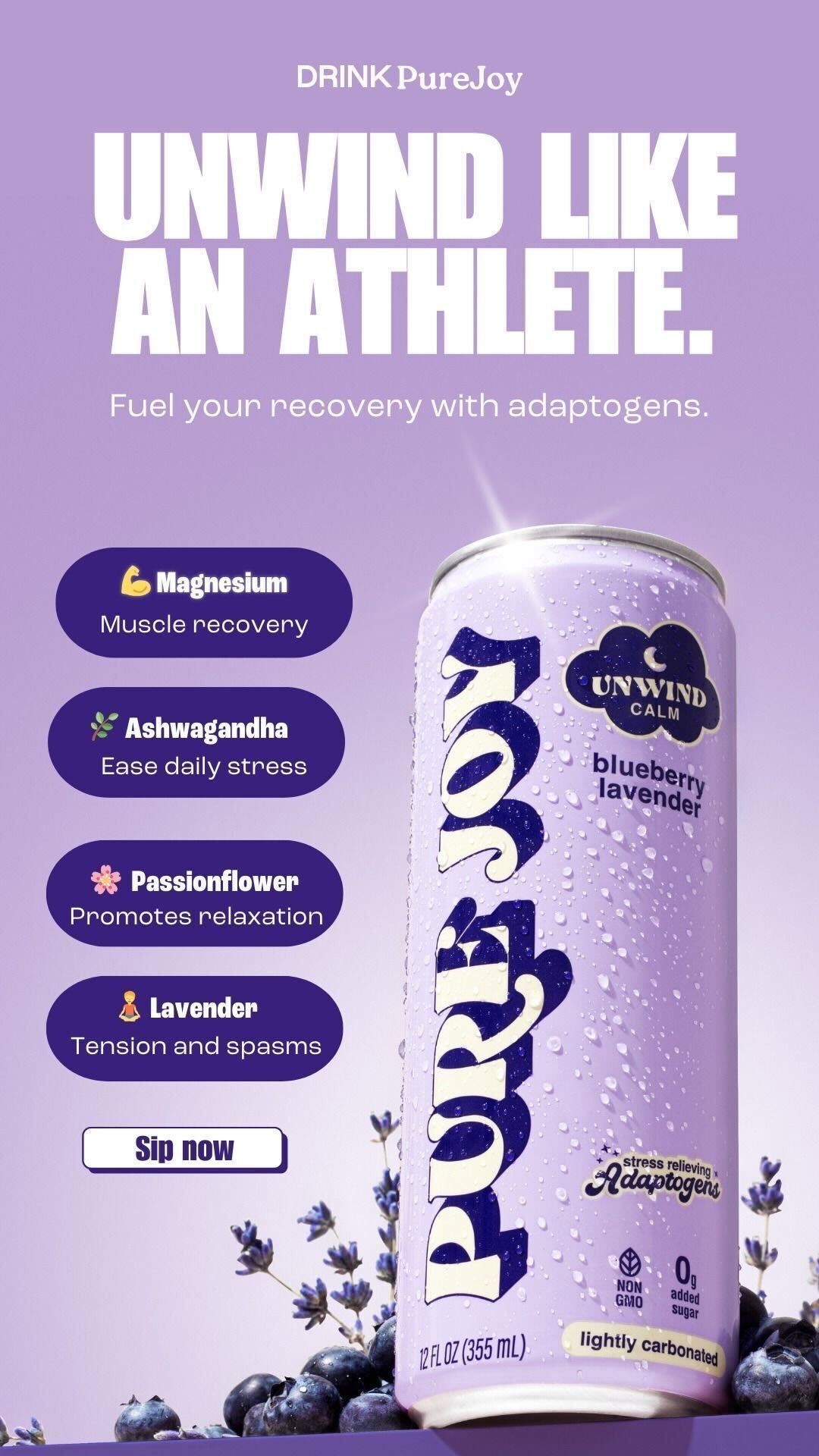
PureJoy nails their product showcase emails.
What this email does well:
Bold headline that speaks to aspiration: "UNWIND LIKE AN ATHLETE." Strong brand colors (purple) that are instantly recognizable. Product hero shot with lifestyle elements (blueberries, lavender) that reinforce the flavor and benefit.
Feature callouts that educate while selling: Magnesium for muscle recovery, Ashwagandha to ease stress, Passionflower for relaxation, Lavender for tension relief. Each ingredient is paired with an emoji and clear benefit.
CTA: "Sip now" button that's simple and action-oriented (would want this button to be a lot larger and clearer though)
This is what 75% of your emails should look like. Designed. Branded. Product-focused. The visuals do the selling. Customers see the product, understand the benefits, and click to buy.
20% Text-Based Emails: Plain text emails that look like personal correspondence. These are pattern interrupt #1. They feel important and personal instead of promotional.
Here’s an example from Dr. Squatch
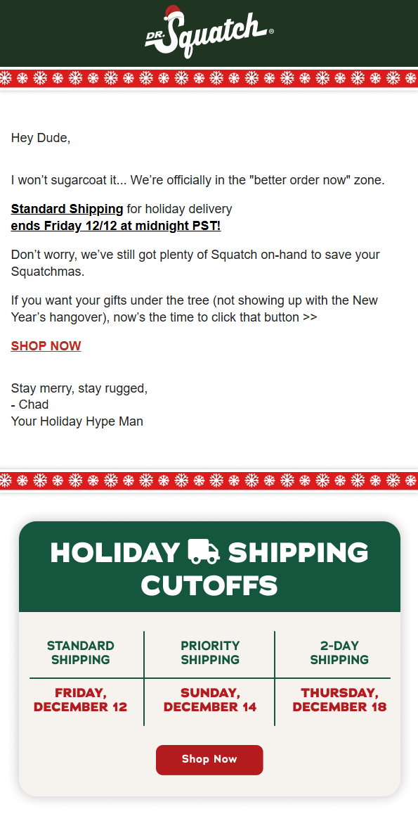
Dr. Squatch’s shipping cut off email.
Why this works as a pattern interrupt:
This email is simple and straight to the point. It has a personal feel and is signed from “Chad, Your Holiday Hype Man".
The tone is casual and conversational: "Hey Dude, I won't sugarcoat it... We're officially in the 'better order now' zone."
The information is practical, not promotional: shipping cutoff dates displayed clearly. The CTA is simple: "SHOP NOW" with no hard sell.
These types of emails should not replace your designed emails. You can send something like this once every 5 emails to break the pattern.
When customers see this in their inbox, it looks important and will get opened.
5% Original Concepts: Weird formats that make people stop scrolling. Listicles. Behind-the-scenes photo dumps. Polls. Anything that makes someone say "I've never seen a brand send this before."
Here’s an example:

Why this works as an original concept:
This is something fun that you don’t see other brands do.
This is a non-alcoholic beverage brand that is sending an email from Saturday morning to Friday night… thanking it for not drinking alcohol.
Creative pattern interrupt.
How to Implement the 75/20/5 Strategy
Audit your last 20 emails. How many were designed product showcases? How many were text-based? How many were original concepts?
Rebalance to 75/20/5:
Keep most emails designed. Customers need to see products. But add 1-2 text emails per 10 sends. Add 1 original concept per 20 sends (as a general rule, but feel free to experiment).
Test out different formats. Run a poll and start getting some real engagement from your customer list.
If you see engagement spike, it means your customers are responding. That’s a good sign.
PS - Something big is coming back…
In October, we quietly dropped a 90-day email marketing mentorship program for 10 brands to help them generate 30-50% of their store revenue from email.
And it sold out in 48 hours before we closed it off.
90 days later… and we’re re-opening it up.
The results have been awesome.
It is an exclusive, invite-only group to maintain the quality of brands.
The waitlist is now open, and we will be launching in early January… inviting only the brands we believe we can help the most that fill out the application below.
(It takes 60 seconds to fill out the application)
Email Inspiration Of The Day
Brand: Magic Mind
Email Design: https://drive.google.com/file/d/1DSe9YLOD8k_a2mfuoCN971RJBP4pKtwP/view?usp=sharing
Notes: This is a cool email showcasing a valuable New Year’s offer. Does a great job of creatively highlighting how much value is packed into the bundle they’re offering.
Template of The Day
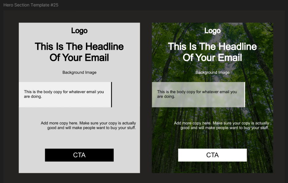
Hero Section Template #25
If you want access to a bank of 134 mix and match templates like this equating to over 5,000+ possible email designs, click here »
Reply to this email if you have any questions or further content you want covered.
Cheers,
Max | Well Copy Email & SMS Marketing
If you want to join our team, fill out this form»
PS - If you run a 7-9 figure ecommerce brand and you want to have a free email strategy consultation, book a call here »
PPS - I have a few different products you can buy. If you purchase any one of these products you get access to my private community of 1500+ members with daily posts from me, access to me for support 24/7, and private calls.
Ecommerce Email Mastery: A 60 lesson course breaking down everything you need to know about ecommerce email marketing in the most concise and organized manner. learn more »
Mix and Match Email Design Templates: 134 email section templates that can make 5,000+ unique email designs with, learn more »
QuickFlow Templates: All core 7 core email marketing flows fully templatized with examples, learn more »